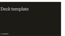
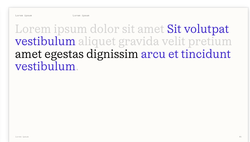
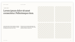
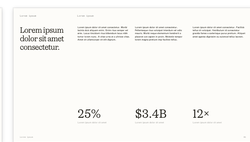
Use the AssemblyAI brand design system with your AI coding tool of choice. It includes tokens, brand guidelines, fonts, icons, and logos. Build marketing websites, decks, assets, ad creative, landing pages, and micro-sites.
Request a review from the relevant code owner(s): design guidance and assets go to @cneri-aai; implementation and general website changes go to @m-ods or @dmalloy-aai.
Merge to production.
I don't know what that means
New to all this? No problem — you don't need to know how to code. Here's what's going on in plain terms.
What this is: the design system is AssemblyAI's official brand kit — its colors, fonts, logos, and ready-made page pieces. All of it is kept together in a project folder called a repository (or "repo" for short).
Where it lives: that repo sits on GitHub, a website teams use to store files and work on them together. "Cloning" a repo just means downloading your own copy onto your computer.
Claude Code is an AI assistant that can read those files and make changes for you when you describe what you want in everyday language — you never type code yourself.
Open any AI chat tool (like Claude), attach that file, and paste one of the prompts below.
Ask for what you want — a page, a social graphic, a deck — and it will build it using the brand kit.
Want the full setup to edit the live site? Message the relevant code owner (@cneri-aai for design guidance and assets; @m-ods or @dmalloy-aai for implementation and general website changes) — they'll help you install Claude Code and get a copy of the repo in a few minutes, then review your work before it goes live.
Prompts
Initial Prompt
Prompt
Use the AssemblyAI brand design system (version 1.1). Clone the repo https://github.com/AssemblyAI-Marketing/assemblyai-website and review README.md and public/brand-design-system/assemblyai-brand-design-system.md before starting — the BrandDesignSystem.md file is the source of truth for tokens, components, and brand rules. Also use the AssemblyAI Claude skills (for example /brand-design-system, /assemblyai-content, and /assemblyai-brand-voice) for any content or brand work. When I prompt you to build, use only the existing patterns, components, layouts, and visual treatments in the design system. Do not create new UI patterns, components, layouts, or visual treatments. Follow the structure, behavior, and visual language already established.
Example prompt: New use-case page
Prompt
Using the AssemblyAI design system, build a new use-case page for [USE CASE, e.g. AI medical scribes]. Compose it only from existing components — top nav, a hero, section headers, feature grids or 3-ups, customer proof, river-flow sections, an inline CTA, FAQs, and the global footer. Keep all tokens, type, color, and motion from the design system, and draw copy direction from /assemblyai-content and /positioning. Do not invent new section patterns.
Example prompt: Social media visual
Prompt
Using the AssemblyAI design system, design a visual to post on social media for [TOPIC OR LAUNCH]. Use only brand colors (Cobolt is the single accent), Oceanic Text headings, Modern Gothic Mono eyebrows and labels, and the AssemblyAI logos and Material Symbols icons. Keep it on-brand, precise, and developer-credible — no new colors or typefaces.
Example prompt: Slide deck Ready — /deck-template
Prompt
Using the AssemblyAI design system, build a slide deck for [TOPIC] with the /deck-template skill. Pick layouts by their selection criteria, fill the content slots, and emit on-brand HTML slides using design-system token classes only. Cobolt is the only accent; headings are Oceanic Text, eyebrows and labels are Modern Gothic Mono.
Example prompt: Social asset Ready — /supporting-imagery
Prompt
Using the AssemblyAI design system, create a social ad/asset for [CAMPAIGN] with the /supporting-imagery skill. Let it pick the right style (Up to seven: UI & Code, Demos, Maps, Pure Abstract, Literal × Abstract, Graphs, Diagrams) and build the asset from design-system tokens, fonts, color, logos, and Material Symbols icons. Cobolt is the only accent.
This design system Markdown file is the source of truth for agents and humans. It contains everything you need to know about the AssemblyAI brand design system.
Foundations
Color palette
Named scales are the brand language. Cobolt is the only accent and CTA color, running deep
(500) to light (100). Black is a warm text and surface scale. White and Neutral carry the warm off-white
backgrounds and borders. Blush is reserved for error and highlight states. Click any swatch to copy the hex.
Three fonts, each with a clear role. Oceanic Text is the serif display face for all headings,
set with tight negative tracking. UN 11ST carries body copy. Modern Gothic Mono handles eyebrows, labels, and
CTAs in uppercase.
Type roles
Font roles
Role
Font
Usage
Display
Oceanic Text (serif)
All headings h1 to h6, weight 400, tight negative tracking
Body
UN 11ST (sans)
Paragraphs, lists, form text, line-height 1.3
Mono
Modern Gothic Mono
Eyebrows, labels, CTAs, uppercase with letter-spacing
Font weight conventions
⚠Headings use Oceanic Text at weight 400. The serif carries the display character, so heavy weights are not used for headings. Body uses UN 11ST at 400, with 700 for inline emphasis only.
Font
Weight
Role
Oceanic Text
400
All headings h1 to h6, display text
UN 11ST
400
Body copy, paragraphs, form labels, nav links
UN 11ST
700
Inline <strong> emphasis only
Modern Gothic Mono
400
Eyebrows, labels, CTAs, uppercase
Live specimen · serif headings at weight 400
Heading · Oceanic Text 400
Accurate speech-to-text for developers
Oceanic Text · Regular 400
Body · UN 11ST 400
Transcribe and understand speech at scale with one API. Body copy uses UN 11ST at weight 400.
UN 11ST · Regular 400
Font families
Accurate speech-to-text for developers
Oceanic TextFallback: Georgia, serif
All headings · display text weights: 400, 500, 700
Serif with character. Set at weight 400 with tight negative tracking for confident headings.
Display font
Transcribe and understand speech at scale with one API.
UN 11STFallback: system-ui, sans-serif
Body copy · paragraphs · UI text weights: 400, 400 italic, 700
Clean sans-serif. Readable body text at line-height 1.3, with 700 reserved for inline emphasis.
Body font
START BUILDING
Modern Gothic MonoFallback: JetBrains Mono, monospace
Monospace. Always uppercase with letter-spacing. Signals the developer audience.
Mono / labels
Oceanic Text, heading scale
Live specimen
h1The best way to build Voice AI apps
h2Speech understanding, built for production
h3Streaming speech-to-text with low latency
h4Diarization and speaker labels out of the box
Font pairing in context
Live preview · all three fonts working together
SPEECH-TO-TEXT
Transcribe speech with state-of-the-art accuracy
Universal-3.5 Pro handles real-world audio across accents, noise, and domains. Send audio over one API and get accurate transcripts, speaker labels, and Speech understanding in return.
Type scale
The type scale maps to the AssemblyAI text styles. Headings use Oceanic Text with tight negative tracking, body uses UN 11ST, and eyebrows use Modern Gothic Mono.
ℹHeadings (h1 to h4) use Oceanic Text. Paragraphs (p2 to p5) use UN 11ST. Eyebrows (e1, e2) use Modern Gothic Mono, uppercase.
The spacing scale runs 4, 8, 12, 16, 24, 32, 40, 48, 80, 120 px, exposed as tokens
--spacing-1 through --spacing-12. Section padding is 120px vertical and 148px
horizontal on the 1440px canvas.
Spacing scale
4px, --spacing-1, tightest gap
8px, --spacing-2
12px, --spacing-3
16px, --spacing-4, default grid gap
24px, --spacing-5
32px, --spacing-6
40px, --spacing-7, card padding
48px, --spacing-8
80px, --spacing-11
120px, --spacing-12, section padding
Container Widths
Class
Max Width
H-Padding
.containerCanonical
75.5rem (1208px), Standard
40px
.container-narrowCanonical
60rem (960px)
40px
.container-narrowLegacy
856px
40px
.container-narrowerLegacy
766px
40px
.container-max-85remLegacy
1360px
,
.container-max-80remLegacy
1280px
,
Grid Patterns
Class
Columns
Gap
.grid-2col
1fr 1fr
3.75rem
.grid-3-col
1fr 1fr 1fr
16px
.grid__4
1fr 1fr 1fr 1fr
,
.grid-5-col
1fr×5
16px
.footer-grid
1fr×5
3rem
.pricing-columns
1fr 1fr
40px
Responsive Breakpoints
Name
Query
Behavior
Mobile
max-width: 479px
Single column, stacked layout
Tablet
max-width: 767px
2-column, simplified nav
Webflow collapse
768px
Mobile hamburger menu activates
Desktop
min-width: 1281px
Full nav with adjusted container padding
Large
min-width: 1900px
Hero image shadow hidden
Foundations
Corners and border radius
The radius scale runs 2, 4, 8, 12, 16, 24px, with a full 9999px reserved for pills like avatars
and tags. Large CTAs use the 4px radius; nav-scale CTAs (tertiary and quaternary) use 2px. Rounding stays
restrained to keep the brand precise.
Radius scale, live preview
2px Nav CTAs (applied directly)
4px Buttons, inputs (--radius-sm)
8px Cards (--radius-md)
12px Large cards (--radius-lg)
16px Featured (--radius-xl)
24px Panels (--radius-xxl)
9999px Avatars, tags (--radius-full)
Token
Radius
Notes
2px
2px
Nav-scale CTAs (tertiary, quaternary). Applied directly, not a scale token.
--radius-sm
4px
Large CTAs, buttons, inputs.
--radius-md
8px
Standard cards and content surfaces.
--radius-lg
12px
Large cards.
--radius-xl
16px
Featured cards.
--radius-xxl
24px
Panels and large containers.
--radius-full
9999px
Avatars, tags, pills only. Not for CTAs.
Primitives
Buttons and CTAs
CTAs are rectangular with a 4px radius (--radius-sm), 40px tall, set in Modern
Gothic Mono at 14px uppercase with 1.4px letter-spacing. Primary uses Cobolt 500 with a Cobolt 300 hover.
Secondary is outlined and fills on hover. Nav-scale tertiary and quaternary CTAs are smaller, 32px tall with
a 2px radius. Cobolt is the only CTA color. On dark backgrounds, switch to the lighter Cobolt dark variants.
Large CTAs (primary + secondary)
On light background
On dark background (dark variants)
Nav CTAs (tertiary + quaternary)
On light background
On dark background (dark variants)
Variant
Background
Border
Text
Primary (cta-primary)
#3923c7, hover #887bdd
1px solid #3923c7
White, Modern Gothic Mono, uppercase
Secondary (cta-secondary)
Transparent, fills #3923c7 on hover
1px solid #3923c7
#3923c7, white on hover
Tertiary (cta-tertiary, nav)
#3923c7, hover #887bdd
1px solid #3923c7
White, mono 12px, 2px radius, 32px tall
Quaternary (cta-quaternary, nav)
Transparent, fills #3923c7 on hover
1px solid #3923c7
#3923c7, white on hover, 2px radius
Dark variants (-dark)
Cobolt 300 (#887bdd) fill / transparent
Cobolt 200 (#b0a7e9) outline
For dark #1d1b16 backgrounds
Primitives
Primitives
Primitives are the smallest building blocks in the component explorer
(/brand-design-system/components/primitives). Everything else composes from these. Buttons and CTAs are
documented above.
Eyebrow
A bordered chip that
sits above headings. Type .e1 (Modern Gothic Mono 12px uppercase, letter-spacing 1.2px), 1px
border, padding 8px 16px.
Speech understanding
Pill (tag, not a CTA)
A rounded-full tag for
model names and labels in feature grids and 3-ups. Border-radius 9999px, 1px border, padding 8px, gap 4px,
UN 11ST 14px. Optional leading Material Symbol.
stroke_fullUniversal-3.5 ProUniversal-2stroke_fullUniversal-3.5 Pro RealtimeWhisper-Streaming
G2 badge
A G2 review badge with
star rating, for social proof.
G2★★★★★ 4.8 / 5 on G2
Primitive
Component
Notes
Eyebrow
Eyebrow (label, dark)
Bordered chip, .e1 mono. Light: border neutral-300 / text black-400. Dark: border black-300 / text black-200.
Pill
Pill (label, icon, dark)
Rounded-full tag, UN 11ST 14px. Light: bg neutral-200 / border neutral-300 / text black-300. Dark: bg black-400 at 30% / border black-400 / text black-200.
CTA pair
CtaPair (variant, dark)
Large (primary + secondary) and nav (tertiary + quaternary) pairs. See Buttons and CTAs.
G2 badge
G2Badge (dark)
G2 review badge with star rating, light and dark.
Icon
Icon (name, size, filled, weight, class)
Material Symbols outlined. See Icons.
Primitives
Icons
The icon system is Material Symbols, Google's outlined variable icon font. There is no custom
icon set and no decorative accent dot. The Icon primitive renders a
material-symbols-outlined span with axes FILL, wght, GRAD, and opsz. Default size 24, weight 400,
outline (FILL 0). Color follows text. Use Cobolt 500 only as a deliberate accent. Browse and pick names at
fonts.google.com/icons.
Sample icons
check_circlecheck_circle
arrow_forwardarrow_forward
dark_modedark_mode
securitysecurity
menumenu
closeclose
expand_moreexpand_more
micmic
speedspeed
locklock
boltbolt
stroke_fullstroke_full
HTML
<!-- Load the font in <head> -->
<linkrel="stylesheet"href="https://fonts.googleapis.com/css2?family=Material+Symbols+Outlined:opsz,wght,FILL,GRAD@24,400,0,0" />
<!-- 24px outlined -->
<spanclass="material-symbols-outlined">check_circle</span>
<!-- filled, 20px, via the Icon component -->
<Iconname="arrow_forward"size={20} filled />
Components
Component library
These are the only approved section components, rendered live below from the real site
components, with light and dark variants where they exist. Compose pages from these and do not invent new
section patterns. Jump to a category, or browse the standalone views at
/brand-design-system/components/<section>.
Free-standing text left (no border), small image right.
Infrastructure you can build a business on
Global redundancy, enterprise-grade uptime, and 2 million hours of audio processed every day. The infrastructure your product can depend on at any scale.
Small image left, free-standing text right (no border).
Infrastructure you can build a business on
Global redundancy, enterprise-grade uptime, and 2 million hours of audio processed every day. The infrastructure your product can depend on at any scale.
Three-column layouts with icons, titles, and descriptions.
Primary
Three columns with icon, 32px title, description, and tag pills.
check_circle
Healthcare
Automate clinical documentation, enhance patient interactions, and streamline compliance workflows.
stroke_full Universal-3.5 Pro stroke_full Universal-2
check_circle
Legal
Transcribe depositions, automate contract review, and extract key insights from legal proceedings.
stroke_full Universal-3.5 Pro stroke_full Universal-2
check_circle
Financial services
Power compliance monitoring, automate meeting summaries, and enhance customer service operations.
stroke_full Universal-3.5 Pro stroke_full Universal-2
check_circle
Healthcare
Automate clinical documentation, enhance patient interactions, and streamline compliance workflows.
stroke_full Universal-3.5 Pro stroke_full Universal-2
check_circle
Legal
Transcribe depositions, automate contract review, and extract key insights from legal proceedings.
stroke_full Universal-3.5 Pro stroke_full Universal-2
check_circle
Financial services
Power compliance monitoring, automate meeting summaries, and enhance customer service operations.
stroke_full Universal-3.5 Pro stroke_full Universal-2
Secondary
Three columns with icon, 24px title (no description), and tag pills.
check_circle
Internal apps that talk to real databases and APIS, not mock data
stroke_full Universal-3.5 Pro stroke_full Universal-2
check_circle
Internal apps that talk to real databases and APIS, not mock data
stroke_full Universal-3.5 Pro stroke_full Universal-2
check_circle
Internal apps that talk to real databases and APIS, not mock data
stroke_full Universal-3.5 Pro stroke_full Universal-2
check_circle
Internal apps that talk to real databases and APIS, not mock data
stroke_full Universal-3.5 Pro stroke_full Universal-2
check_circle
Internal apps that talk to real databases and APIS, not mock data
stroke_full Universal-3.5 Pro stroke_full Universal-2
check_circle
Internal apps that talk to real databases and APIS, not mock data
stroke_full Universal-3.5 Pro stroke_full Universal-2
Numbered
Three columns with circular numbered eyebrow (01/02/03) instead of an icon. Used for quick-start sequences.
01
Get your API key
Grab your AssemblyAI key from the dashboard.
02
Set the base URL
Point your OpenAI client at https://llm-gateway.assemblyai.com/v1
03
Send a request
Pass any supported model name and start sending requests.
01
Get your API key
Grab your AssemblyAI key from the dashboard.
02
Set the base URL
Point your OpenAI client at https://llm-gateway.assemblyai.com/v1
03
Send a request
Pass any supported model name and start sending requests.
Components
FAQs
Accordion FAQ sections with expandable pairs.
FAQs
Accordion FAQ with native details/summary elements.
Common questions
We have speech to text models available for both pre-recorded audio and live transcription settings. For pre-recorded, Universal-3.5 Pro is our most accurate model, delivering best-in-class transcription across a wide range of audio types and languages. Universal-2 offers excellent accuracy at a lower price point. Our streaming models are optimized for real-time use cases, with Universal-3.5 Pro Realtime delivering the highest accuracy and Universal-Streaming providing a cost-effective option.
Yes! You can sign up for a free account and get started with our API immediately. No credit card required.
Yes, we offer volume discounts for customers processing large amounts of audio. Contact our sales team for details.
You are billed based on the amount of audio you process each month. We offer both pay-as-you-go and committed use plans.
Common questions
We have speech to text models available for both pre-recorded audio and live transcription settings. For pre-recorded, Universal-3.5 Pro is our most accurate model, delivering best-in-class transcription across a wide range of audio types and languages. Universal-2 offers excellent accuracy at a lower price point. Our streaming models are optimized for real-time use cases, with Universal-3.5 Pro Realtime delivering the highest accuracy and Universal-Streaming providing a cost-effective option.
Yes! You can sign up for a free account and get started with our API immediately. No credit card required.
Yes, we offer volume discounts for customers processing large amounts of audio. Contact our sales team for details.
You are billed based on the amount of audio you process each month. We offer both pay-as-you-go and committed use plans.
Components
Inline CTA
Inline call-to-action banners for mid-page conversion.
Inline CTA Primary
Bordered inline CTA banner with title, description, and button.
Alternating content blocks with text panels and media.
Left Primary
Stacked left-aligned cards with bordered text panel and large image.
Security
Security and privacy
AssemblyAI uses enterprise-grade security practices to keep your data safe. We approach security by design and default, and continuously ensure AssemblyAI is secure for you and your team.
Alternating left/right cards with bordered text panels.
Security
Security and privacy
AssemblyAI uses enterprise-grade security practices to keep your data safe. We approach security by design and default, and continuously ensure AssemblyAI is secure for you and your team.
Alternating cards with heading + feature list and medium image.
Speech-to-Text
Real-time transcription
Stream audio and receive transcriptions in milliseconds with our WebSocket API.
Batch processing
Speaker diarization
Custom vocabulary
Audio Intelligence
Summarization
Generate concise summaries of audio content using LLMs.
Sentiment analysis
Topic detection
Entity detection
Voice Agents
End-to-end voice AI
Build conversational voice agents with natural speech synthesis.
Custom voices
Function calling
Guardrails integration
Architecture
Site structure
The site uses Astro file-based routing: a file at src/pages/<path>.astro serves
at /<path>, a folder becomes a URL segment, and a [slug].astro file is a dynamic
route. Use this map to decide where a new page belongs before creating one. Most new pages slot into an
existing folder rather than the top level.
src/pages/ → URL → purpose
src/pages/
├── index.astro /Homepage: brand + product overview
├── about · careers · newsroom /about · /careers …Company: story, hiring, press
├── pricing · enterprise /pricing · /enterprisePlans, and the enterprise pitch
├── security · benchmarks · changelog /security …Trust, proof, release notes
├── products.astro + products//products · /products/*Product index + one page per product
├── solutions//solutions/*Industry / use-case pages
├── features//features/*Single-capability deep-dives
├── deployments//deployments/*Cloud vs self-hosted
├── compare//compare/*Competitor comparisons
├── universal-2 · universal-3-pro … /universal-*Model launch / landing pages
├── blog + blog/[slug]/blog · /blog/:slugIndex + posts (dynamic)
├── customers · research · partners · …/:slugIndex + entries (dynamic collections)
│ legal (each: index + [slug])
├── contact//contact/*Lead-capture forms by intent
├── spotlight · assembly-required · /spotlight …Programs, video series, campaigns
│ explore/
├── listen · pete · v2 /listen · /pete · /v2Microsites and experiments
├── api//api/*Backend endpoints (not pages)
└── design-system//internal/*Internal-only (this design system)
URL path
Source
What lives here
/
index.astro
Homepage — brand + product overview and primary conversion paths
/about/careers/newsroom
top-level *.astro
Company: story, hiring, press
/pricing/enterprise
top-level *.astro
Commercial: plans, and the enterprise pitch
/security/benchmarks
top-level *.astro
Trust and proof: compliance posture, model benchmarks
/products/products/*
products.astro, products/*.astro
Product family index + one page per product
/solutions/*
solutions/*.astro
Industry and use-case pages (notetakers, contact centers, medical, …)
/features/*
features/*.astro
Single-capability deep-dives (diarization, language detection, …)
/deployments/*
deployments/*.astro
Deployment models: AssemblyAI Cloud vs self-hosted
Standalone microsites and experiments (CLI tool, voice demo, A/B variant)
/api/*
api/*.ts
Backend / serverless endpoints — not rendered marketing pages
/internal/*
internal/**
Internal-only tools, including this design system (soft-gated, noindex)
Where should a new page go?
A new product → products/<name>.astro (and add it to the /products index).
A new industry or use case → solutions/<name>.astro.
A deep-dive on one capability → features/<name>.astro.
A competitor comparison → compare/<competitor>-vs-assemblyai.astro.
A deployment option → deployments/<name>.astro.
A blog post, customer story, research piece, partner, or legal doc → add an entry to the matching dynamic collection (/blog, /customers, /research, /partners, /legal); do not hand-author a standalone page file.
A contact or lead-capture form → contact/<name>.astro.
A marketing or co-marketing campaign → explore/<name>.astro.
A model launch → a top-level <model-name>.astro (matches existing universal-* pages).
An internal-only tool → under internal/, never indexed or linked publicly.
A one-off standalone page that fits none of the above → a top-level src/pages/<name>.astro. Use sparingly; prefer a folder when a second sibling page is even plausible.
Skills & templates
Content and AI skills
Marketing content for AssemblyAI is produced with a set of Claude skills. Invoke a skill with
its slash name, for example /assemblyai-content. Use these as the on-brand path for any copy, blog,
or content task.
Writing or reviewing any customer-facing copy for brand consistency
/assemblyai-content
Publish-ready AssemblyAI content: blog posts, use cases, tutorials, landing copy
Drafting or rewriting any content for assemblyai.com
/assemblyai
Implementation guidance for AssemblyAI speech-to-text, streaming STT, audio intelligence, and voice agents (APIs and SDKs)
Building demos, code samples, or voice-AI features with the AssemblyAI API
/copywriting
Copy across channels: web, ads, email, social, product/UX, long-form
General copy tasks and ad, email, or social drafts
/ctas
Insert correctly formatted CTAs into blog posts
Finalizing any blog post
/faq-generator
Add optimized FAQ sections (AEO + SEO)
Completing content that should capture search and answer-engine traffic
/internal-links
Add internal links to blog drafts
After a blog draft is written
/link-verification
Verify every link is real and reachable
Final step before publishing any content
/blog-table-style
Brand HTML table styling for the blog
Any table that will appear in a blog post
/hipaa-language-check
Enforce approved HIPAA and BAA language
Any healthcare-adjacent content
/medical-mode-claims
Canonical Medical Mode claims (accuracy, competitive, activation, languages, pricing) plus approved compliance language. Full spec: medical-mode-claims/SKILL.md
Any Medical Mode or medical-transcription content
/knowledge-base
Ground content in AssemblyAI knowledge bases (AirOps)
Before and during any content task, for accuracy
/positioning
Product positioning guidance
Messaging and positioning decisions
/pricing
Pricing guidance
Pricing pages and pricing copy
/brand-design-system
Apply and maintain this design system
Building or reviewing marketing pages and assets
/supporting-imagery
On-brand supporting imagery for decks, web, social, and ads, in seven defined styles (UI & Code, Demos, Maps, Pure Abstract, Literal × Abstract, Graphs, Diagrams). Full self-contained spec: supporting-imagery/SKILL.md
Designing, generating, or speccing any marketing visual, hero, section graphic, chart, diagram, or background
/deck-template
Agent-driven slide generation from the brand deck template (HTML slides on a 1920×1080 canvas, fixed tokens + reusable components). Wraps deck-template/ in this folder; see the Deck template section
Building or generating an AssemblyAI presentation, deck, or individual slides
/deep-research
Multi-source research harness: fan-out web searches, verify claims, synthesize a cited report
Deep, fact-checked research for briefs, positioning, or competitive analysis
Skills & templates
Planned skills (placeholders)
Skills we should have for marketing work but have not built yet. These are placeholders. Create
them as dedicated, AssemblyAI-specific skills.
Planned skill
Status
Scope
Ads / paid media
PLACEHOLDER, not yet built
Search, social, display, and video-script ad copy with AssemblyAI voice and proof points. Today, use /copywriting as a stopgap.
Social media
PLACEHOLDER, not yet built
LinkedIn, X, and thread formats with platform-native tone.
Email and lifecycle
PLACEHOLDER, not yet built
Nurture, launch, and newsletter sequences.
Case study / customer story
PLACEHOLDER, not yet built
Structured customer-outcome stories that credit the customer.
SEO / AEO content brief
PLACEHOLDER, not yet built
Keyword and answer-engine briefs that feed /assemblyai-content.
Sales collateral / one-pagers
PLACEHOLDER, not yet built
Metric-backed sales-facing assets.
Skills & templates
Deck template Built
A reusable AssemblyAI slide deck system — the working implementation of the brand rules in
assemblyai-slides-guidelines.md. Slides are self-contained HTML authored on a native
1920×1080 canvas and scaled to fit, composed entirely from fixed tokens and reusable
components.
A few layouts at a glance — 39 reference slides span six families
(Title / Section · BIG TEXT · GRID · 4 COL · Top / Bottom + COL · Editorial). Open
deck-template/examples.html for the full set.
Reference
CSS variables
Complete :root token block from the AssemblyAI @theme. Color scales,
semantic aliases, fonts, spacing, and radius. Copy and paste into any project.
Spacing scale, text colors, and background colors available as utility classes. Component patterns for common interactive elements.
Margin Bottom
Class
Value
margin-bottom-0
0
margin-bottom-0-5rem
0.5rem (8px)
margin-bottom-1rem
1rem (16px)
margin-bottom-1-5rem
1.5rem (24px)
margin-bottom-2rem
2rem (32px)
margin-bottom-2-5rem
2.5rem (40px)
margin-bottom-3rem
3rem (48px)
margin-bottom-4rem
4rem (64px)
Margin Top
Class
Value
margin-top-1rem
1rem (16px)
margin-top-1-5rem
1.5rem (24px)
margin-top-2rem
2rem (32px)
margin-top-3rem
3rem (48px)
margin-top-4rem
4rem (64px)
margin-top-6rem
6rem (96px)
margin-top-8rem
8rem (128px)
Padding
Class
Value
padding-top-0
0
padding-top-3rem
3rem
padding-top-4rem
4rem
padding-bottom-2rem
2rem
padding-bottom-4rem
4rem
padding-bottom-8rem
8rem
padding-tb-5rem
5rem top + bottom
Text Color Classes
Class
Color
Swatch
text-color-cobolt
#3923c7
text-color-cobolt-400
#614fd2
text-color-dark
#1d1b16
text-color-white
#ffffff
text-color-black
#4a4945
text-color-muted
#777673
text-color-faint
#a5a4a2
Background Color Classes
Class
Color
Swatch
bg-color-white
#ffffff
bg-color-page
#fdfcf8
bg-color-cobolt
#3923c7
bg-color-dark
#1d1b16
bg-color-cobolt-400
#614fd2
bg-color-cobolt-100
#d7d3f4
bg-color-neutral
#ecebe5
bg-color-blush
#f4d4d0
Motion and interaction
Motion is restrained and functional. State changes shift color and border, not position. There are no card-lift or drop-shadow hovers. State transitions run at 0.2s ease; expand, collapse, drawer, and chevron motion uses the signature curve cubic-bezier(0.22, 1, 0.36, 1). All non-essential motion respects prefers-reduced-motion.
Token
Value
Usage
State transition
0.2s ease
Hover/focus color, background, and all changes on links, buttons, cards
Border transition
0.15s ease
Border-color shifts on inputs and bordered cards
Signature easing
cubic-bezier(0.22, 1, 0.36, 1)
Accordions, drawers, chevron rotation, paired with duration-300